How are your pictures coming?
Did you clear out the clutter in your backgrounds last week?
Are they looking less like snapshots?
This week we’re talking: Composition
Composition: the act of combining parts or elements to form a whole
This is one of the most important parts of creating an interesting photo. This is what will grab the viewers’ attention and keep it there longer than a snapshot will.
There are several elements in composition but I’ll go over four main ones for this post:
- Framing
- The Tilt
- Perspective
- Rule of Thirds
Framing
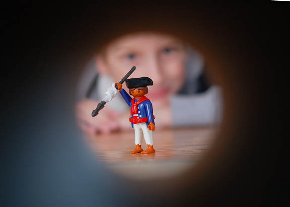
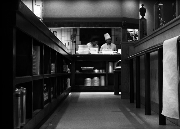
And I’m not talking about picking up a frame from your local Target and slapping your photo into it. Nope. The framing I’m referring to is the technique of drawing attention to the subject of your image by blocking other parts of the image with something in the scene. This is a great way to draw your viewer into your photo while giving your photo context. This requires a little bit of creativity. You have to “think outside the box”, or inside the box (if you can find one). Look around for things that can act as a visual frame for your photo.
This was shot through a paper towel roll. I shot wide open (aperture), thus the blurry foreground and background.
Shot looking up the stairs of a very high slide. The railings and steps draw your eye up to the subject while the top of the slide acts as a frame around him.
The curve of the faucet, the running water, and her arm create a circle framing her face.
Shot from a restaurant while I held the camera under our table. Lucky shot! The lines of the shelving and shadows on the floor lead your eye up to the chefs who are framed by the huge hood above them.
Shot through the tunnel at the playground.
The Tilt
“To tilt, or not to tilt. That is the question.”
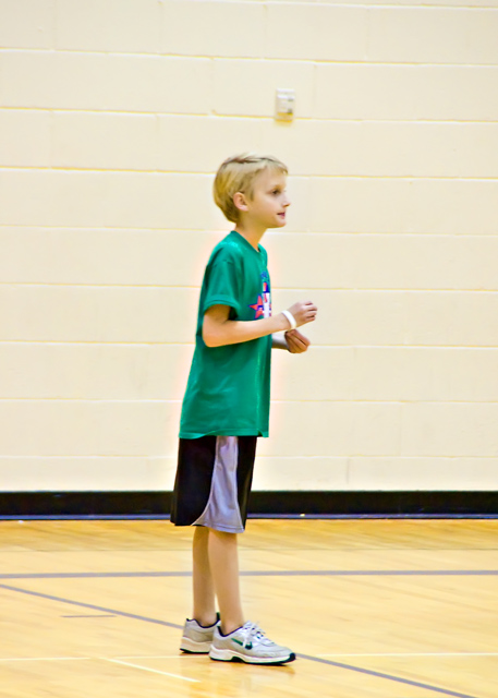
I went through a period where I tilted all of my images. They all looked like the subjects they were sliding off of the paper. I have since refined my art of The Tilt and only do it occasionally. Whether or not you choose to tilt is totally up to you but, I think there are times when a tilt just looks wrong in a picture. Usually when there is an obvious horizon.
This is a snap taken in a gym with very poor lighting, but it serves as a good example of a bad tilt. This image has an obvious horizon, where the floor meets the wall behind him. It should be parallel to the bottom of my image. A quick crop in your editing program solves this easily.
Much better!
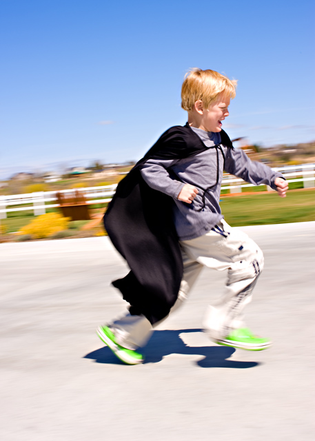
Here’s an example of an uncomfortable tilt, taken during my “tilting period”. The tractor feels like it’s on the verge of falling out of the frame.
And a better use of a tilt:
It’s slight. The horizon line is not as obvious and he looks comfortable at that angle.
Perspective
This is one of my favorite elements to play with. This is what will make your image interesting. I’m talking about taking the photo from a perspective other than shooting your subject straight on from a typical standing position. That can get boring if that’s the only perspective you shoot from. Get creative! Shoot from above. Lie down and shoot from below. Shoot from behind. Don’t worry what others might think of you. When you’re holding a camera, anything goes.
Here’s a shot from the typical perspective of straight on, standing up:
Cute, but kinda boring.
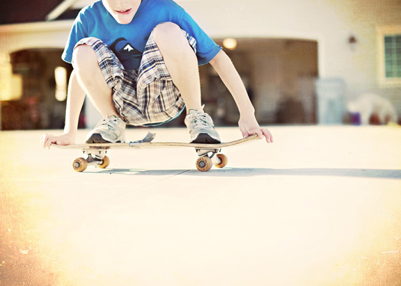
Look how much more interesting it is when I got down on the cement and shot:
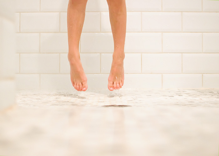
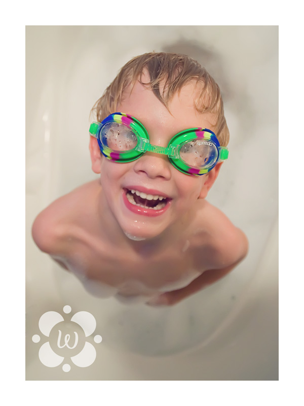
Here are some more from different perspectives. See if you can tell where I am shooting from:
Rule of Thirds
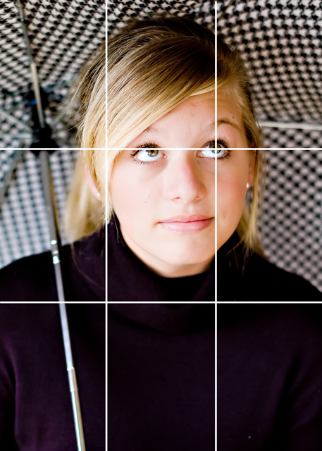
One of the most popular “rules” in photography is the Rule of Thirds. It’s also popular in art. Here’s how it works. Imaginary lines are drawn dividing the image into thirds horizontally and vertically. Important elements in your image should be placed near the intersection of those lines.
The theory is that if you place points of interest in the intersections or along the lines that your photo becomes more balanced and will help the viewer interact with your image more naturally. Studies have shown that when viewing images, people’s eyes usually go to one of the intersection points more naturally than to the center of the shot. ( The next time you’re watching Glee or Grey’s Anatomy, or American Idol, and especially commercials, take note of where the important elements fall within the shot. Most of the time they will not be in the center of the television.)
Usually you will do this ‘in camera’ when you are composing the shot before you take it. Sometimes you can crop it while editing to conform to this rule. When I follow the Rule of Thirds, I tend to favor the upper right intersecting point and most of my important elements end up there.
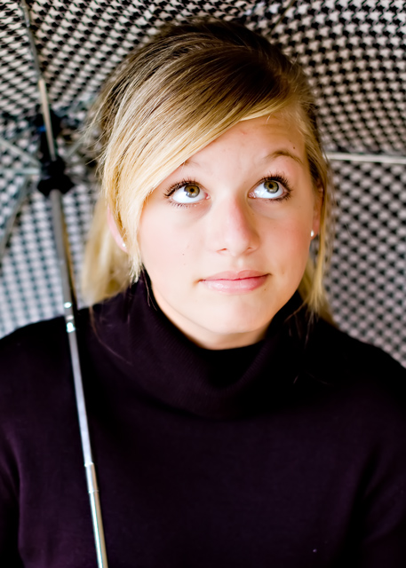
Here’s my photo. (Notice I blocked my cluttered background with an umbrella. A great trick when you don’t feel like clearing out clutter)
The eyes are the most important part of a portrait. Notice I’ve placed one of her eyes in the upper right intersection of my photo. Her other eye falls along the horizontal line, so it works well.
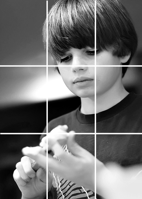
Here are a couple more examples:
I’ve got his face in the upper third and his hands in the lower third. The viewer goes straight to the eyes first (upper third) and follows his gaze down to his hands (lower third) which are an important element in the image.
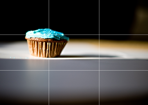
YUM!
But just as in every rule, there are exceptions.
Sometimes you just need symmetry.
Sometimes your subject is just begging to be front and center:
Have fun.
Get creative.
See what you come up with. I bet you’ll be surprised and inspired to keep shooting!
Next week: Avoiding the dreaded …
FAKE SMILE
Thanks Wenderful!
I just love calling her that!
We really appreciate all the time and effort you put in each week to help us take better pictures!
Maybe if we’re nice to her, she’ll teach us a little bit about Photoshop next…
Will you go over and give her some comment love?
Thursdays are my new favorite day!
Have a Terrific Thursday 🙂
XOXO













LOVE this post!! I'm definitely going to go out and snap some shots this weekend with these ideas in mind! Can't wait!!♥
fantastic tips! love the ideas about the tilting. i have avoided tilts my whole life…now i may just change that!!
Thanks for the great tips!
WOW! Wendy is awesome! I am learning sooooo much! Thank you! Thank you! Thank you! This series ROCKS!
love these tips! i had never thought much about framing before, thanks!
Those are awesome tips and even cooler shots!
Great tips! I wonder if I can get my boring little camera to do anything cool…
Lately I've been favoring the lower right hand corner! Funny how we fall into such un-obvious trends until we start going through the pictures!
http://www.theiheartblog.com
I am learning so much from this series!! I don't know that my point and shoot Sony allows for much to play around with, but I can try, right? 😉
love this! i'll have to share this with my mother…
I am LOVING these tips! Jen, your sister is amazing!
She says to take your camera off of auto. I'm like, "I don't use auto, I adjust the flash."
Yeah. I looked. Guess where my thing was at? AUTO.
So now, I'm taking much more interesting pictures, although I still did the limb chop the other day. WOOPS.
Great advice! I sure hope I can bring my photos up to your level. Did I miss week 3 though? Distance from your subject. i guess you touched on it a bit with the cluttered background…just wondering.
Thank you so much for the tips. I'm very new at this blogging thing and need all the help I can get. You are so right, the better the photos the better the blog.
thanks so much for the tips…..I didn't know any of that.
Great tips! I think I use the rule of thirds….at least I try.
Oh the tilt – LOL. love it too but learning to not use it as much 😉
thanks wenderful! 🙂
Great tutorial! You explain it so well, and give fab examples.
thank you! i'd love some advice on lenses and necessary photo equipment, if you are looking for additional future subjects. I just got a canon rebel and have no idea what I need to really take my photos to the next level.
I have heard of the rule of thirds, but never seen it layed out on an actual photo before! That is really helpful in visualizing how to set up a shot!
WOW Great tips, thanks for sharing I will definetly keep these in mind next time I have the opportunity to get some great shots!
Merci beaucoup pour tout tes précieux conseils, je prend en note.
Bonne journée.
Josée