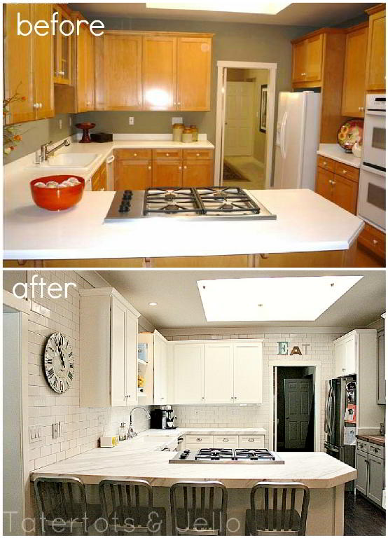
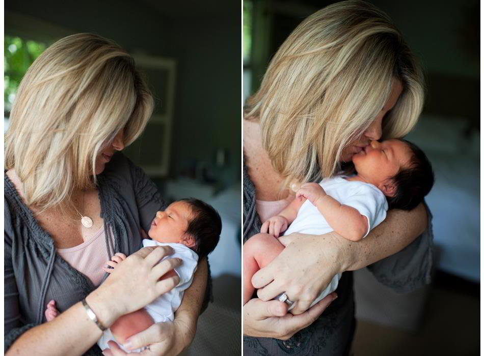
I was able to spend the weekend with my sister Ashley and her new baby Charley. It was a quick visit but so much fun to spend time with my mom and Ashley and her little family. And while I was there I was able to spend time in Ashley’s beautiful home. She recently remodeled her kitchen and she said I could share it with you!!
(photo from Wendy Vonsosen Photography)
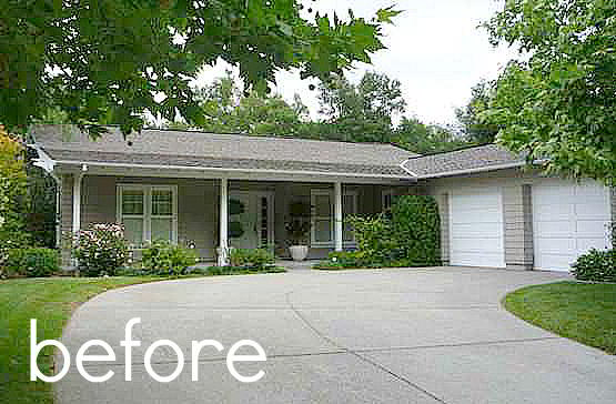
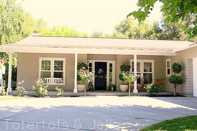
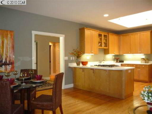
Ashley and her husband Nick spent a long time finding the perfect home. They were looking for a home that had great bones and could be updated easily. They finally found a home on a beautiful, tree-lined street. I like to call her street “Wisteria Lane” because it seems that perfect LOL!! Ashley said that she knew this house was the one when she first saw it because it had a great floor plan with classic details like square baseboards and shaker-style cabinets. Even though the maple cabinets had yellowed with age, she knew they could be easily painted for a classic look.
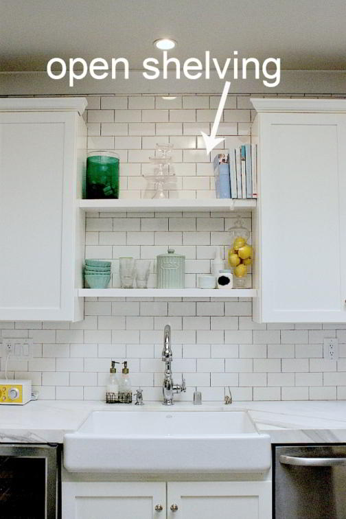
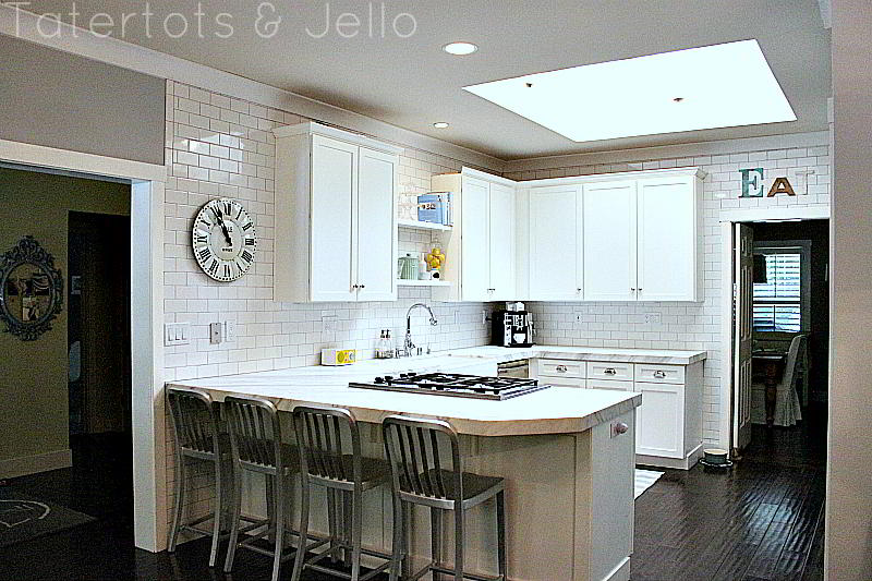
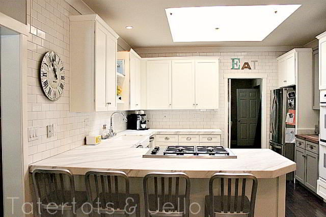
When she was planning out the kitchen, Ashley started a Pinterest board with ideas she loved. She found the idea for tiling the whole wall up to the ceiling on Pinterest. She also wanted a little open shelving, but not too much. She loved the idea of the open shelves to display items like cookbooks and cake plates, but she also knew with a small child and another on the way, she needed cupboards she could tuck things away in.
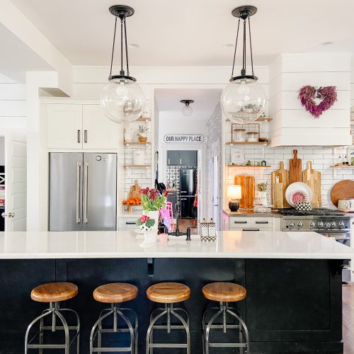
So she opened an small area above the sink for two shelves. And she loved the look of the open shelves there. She found her shelves from West Elm.
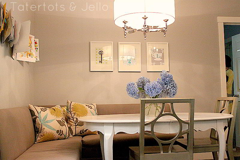
In the corner of the kitchen she made a little banquette. The banquette benches open up and she is able to keep things like placemats in there which is very handy. She chose a very neutral color and then ordered some colorful pillows from etsy. Above the table she framed some prints, also from etsy, and on the opposite wall she made an art display center.Banquettes are great because they offer very comfortable seating, plus you can seat more people around them than you would think!! I have the same banquette in my kitchen and we love ours. Ashley and I both bought our banquette components from Ballard Designs.
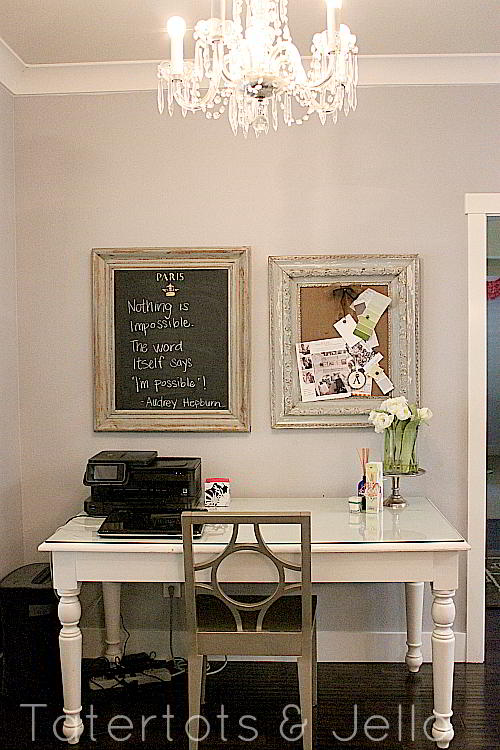
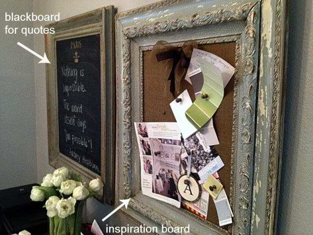
On the opposite side of the kitchen, near the entrance Ashley installed a modern, white desk. It is a great area for Ashley to check her email or work on orders for her store while her son has lunch. It’s also next to the window which leads to the front of the house. Ashley has a blackboard above the dedsk where she loves to write inspirational quotes and next to that is a bulletin board where she keeps items for projects that are coming up. She added an antique chandelier above this are to combine the two different styles.
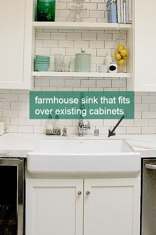
The whole remodel was quite inexpensive. The subway tiles are very cost-efficient. She added grey grout to modernize the look. Instead of getting new cabinets, Ashley painted the existing cabinets. And she also found a farmhouse sink from Kohler. Kohler makes two different version of this farmhouse sink — and the best part is that you don’t have to alter your existing cabinets, the sink fits over the cabinets. What a great idea!!
The most expensive part of the remodel was the carrera marble countertops. If you are looking for the same look for less money, there are some man-made stone alternatives which are a fraction of the cost.
Thanks Ashley for letting us into your beautiful home!!
Happy Monday!!
xoxo





Hi,
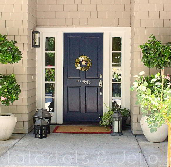
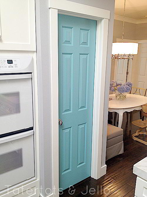
I love the blue laundry room door! Could you tell me what color paint you used?
What color was used for the kitchen walls? I love the pop of the pantry door!
Beautiful. I want to remodel my kitchen also.
What a great post. Your sister’s house is just beautiful. Would you be able to tell me where she purchased the chairs she has around her table. The design on the back of them is so cool. Thanks!
Very nice! It’s cute too that you and your sister are Jen and Ashley! That’s my and my sister’s names lol
I absolutely love this. I am wondering if you sprayed your cabinets or painted them by hand? Also, what paint color did use for your wall color in the kitchen?
Gorgeous kitchen renovation! Her whole house is beautiful–and of course the baby too!
It’s really beautiful. I painted my exterior door a bright beautiful blue a few years ago too. It makes me smile every time I pull in the drive. Gorgeous baby!
What a beautiful home!
She did a beautiful job with her home! I am trying to muster up the courage to paint our cabinets white. Thanks for sharing such inspiring photos! {I am loving the banquette}
just beautiful 🙂
really beautifully done! love the subway tiles, really makes the light bounce and brightens up the whole room! well done!
Is there anyone in your family that isn’t gorgeous and talented?? Sheesh! 🙂
I love, love, love that blue door!!! I’d love to know what color that is!! Beautiful, and a beautiful baby too! Congrats to your sis.
Wow! It’s so pretty! All of the amazing touches make it look very high end!!!
Do you know how she made the art station or where she bought it? Seems like a great idea to keep art project contained in one area.
Hi Kate. I used a curtain rod system from Ikea for the art center. It is great because you can make it any length you want and it comes with clips that make it so easy to change out the artwork! Here’s the link:
http://www.ikea.com/us/en/catalog/products/60075295/
Oh I just love it! What a great transformation.
Beautiful Asley! Do you have a blog?
Magnificent!